This is really an otherworldly-looking canyon, and the lighting in the photo is great. I referamed it - I quite like the more abstract look without the sky that focuses more on the meandering shapes of the canyon walls.
Post-processing-wise, I upped the blacks, nothing more.
Nice atmospheric photo. Unfortunatelly, it works better in a portrait format than landscape, which turns it mostly into texture. So I added in the motor glider as a point of interest. I also added in some clouds in the top right corner, because the sky there was just a dull grayish-blue triangle.
As far as processing goes, I just upped the light.
Since I seem to be writing a lot about things I dislike, another one I'm not fond of is the clichéd reflection in the calm body of water. I find that the kaleidoscope effect detracts from the subject. What I do like is when it's done with a twist, like here, with a beautifuly colored reflection broken up by the rocks in the foreground. Photo by reddit user Tio76, I couldn't find out anything more.
This is also a good example of real vs. percieved. In the original photo, the horizon is as level as can be, but due to the slowly rising shore on the right, and the small hill with the palmtrees, it actually looks like it's not, resulting in the whole photo being a bit unbalanced. So I made it look level, without really being so. The only other thing I did is fix the artefacts left over by the digital sharpening of the original image.
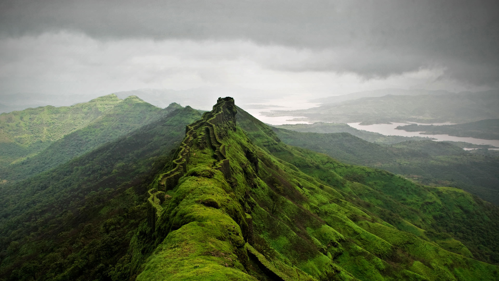
I really like this, looks like the walls and stairways of the fort are sprouting straight out of the ridge of the mountain.
But this is a good example of another pet peeve of mine - vignettes! A lot of times, they will be caused by the lens, but more often than not, photographers add them in to draw your eye to where they want to. I really really dislike them, and they are really really hard to remove. I think that if you have to use them, there is already something wrong with your composition and lighting. They are OK when subtle, but again, more often than not, people go overboard. And it tends to become a habit - they start poping-up wheter there's any need for them or not. 'It cant hurt.' Yes it can. It's like you put horse blinders on the viewer's eyes. They're looking where you want, but it's not pleasant.
So, I removed the bloody thing. I actually used the Windows 10 Spotlight version of the photo as the starting point, because they did a good job of reframing it. It looks better with the fort at the left third instead of dead center, opens out the background nicely on the right. Also, I darkened the top cloud, to better focus on the subject (there, do things like that, instead of adding in @"#$! vignettes), and to reduce the glare, which, as I said before, I don't like in wallpapers.
This is a photo by the reddit user brodme. I don’t have any credit beyond that. The first of many weird/impressive rock formations I am going to post - I like them.
Reframed this from a portrait photo - it works better as the original portrait, but I'm not going to look at my laptop sideways, so it is what it is. Lowered the contrast a bit to bring out the detail out of the shadows, and warmed up the image slightly to emphasize the low sun.
Now, I am going to rant at length about a pet peeve of mine, feel free to skip. When and who decided that photos of waterfalls have to be shot at long exposure?! Was there a memo? I guess it was interesting the first time - it does give the waterfalls a certain dreamlike quality - but now it’s almost impossible to find any photo of a waterfall that doesn’t look like white mush. Long exposure has just become a lazy shortcut - use it, and you’ll get a decent picture without much effort. Waterfalls frozen in time with a short exposure can look weird, but when done right, the result are spectacular, and no mush can compare. The photo above is a case in point. I had a hard time finding it. End rant, but I’ll be talking more about this again.
This went through a lot of processing. The original photo was a portrait, and when reframed for the 16:10 screen the part I focused on was much too bright by itself. I had to bring it down, and bring out the detail. The colors themselves should be plausible, as the main thing about this waterfall is that the water does look bright blue in real life.
There’ll be more Iceland. Much more, because Icaland is photography on easy mode - the place looks amazing wherever you point the camera. So that’s what photographers do, when they get there - point their cameras wherever.