Very pointy. With one of the most beautiful auroras I've seen in a photo in the background. I removed the guy from the summit. Didn't actually have anything against him - he works great as a point of interest in the original portrait format. But in the reframed landscape, he is just a little too close to the edge of the frame and drags the eye out of the photo instead of in.
I also sharpened the whole thing for added detail.
Coz we're half way there. This is the 183rd wallpaper. Exactly half way through the year. And this one is fitting, because a photo of this particular place - Seceda in Italy - made me waant to start collecting landscapes. Here is the photo. Technically, it's pretty bad, but the atmosphere is something else. So I wanted a similar, but higher quality photo of this cliff, during a cloud inversion. Easier said than done. I finally found one I almost liked, but it was shot during a very sunny day, with too much glare for my taste. So I decided to make it more moody, and here's the result.
I turned the sky stormy, and tried to make it look like there is a hole in the clouds somewhere off-screen through which the sky shines onto the green plateau. You be the judge if I succeeded (had to really hold myself back not to make a really bad pun here. But now you have it in your mind anyway, don't you?)
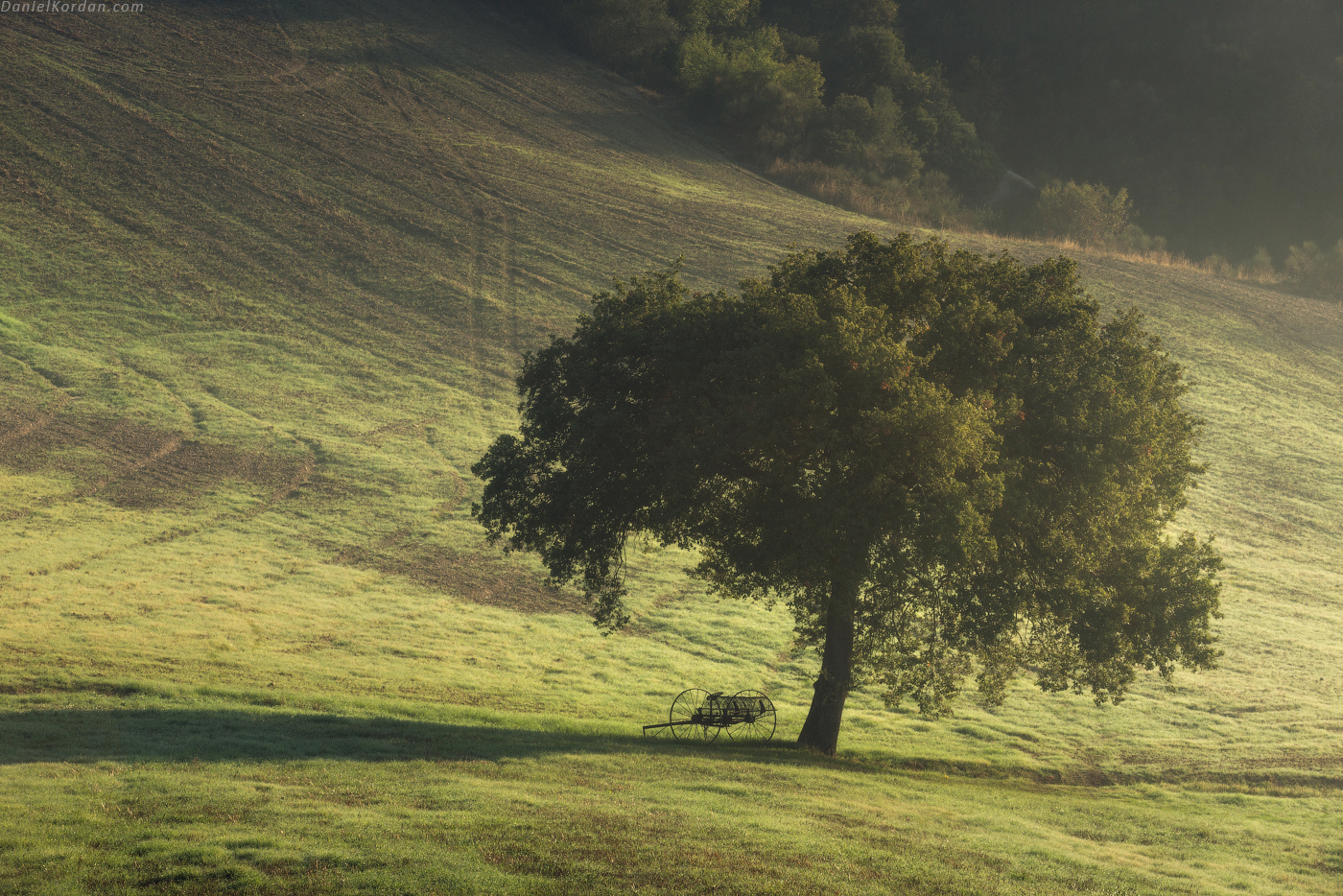
I liked this photo - especially the silhouetted cart, but not the colors. Pale, monochrome and dirty.
So I went to town with them. I decided to make something that would look pretty to me, even if not exactly realistic. Warm, kind of what it may look like during the sunset. And I didn't like the look of the mud, so I made it more reddish.
I think I have a problem - this photographer calls his processing 'Dark Processing,' and generally produces dark photos, but I still thought it could be darker. So darker it is. Help.