
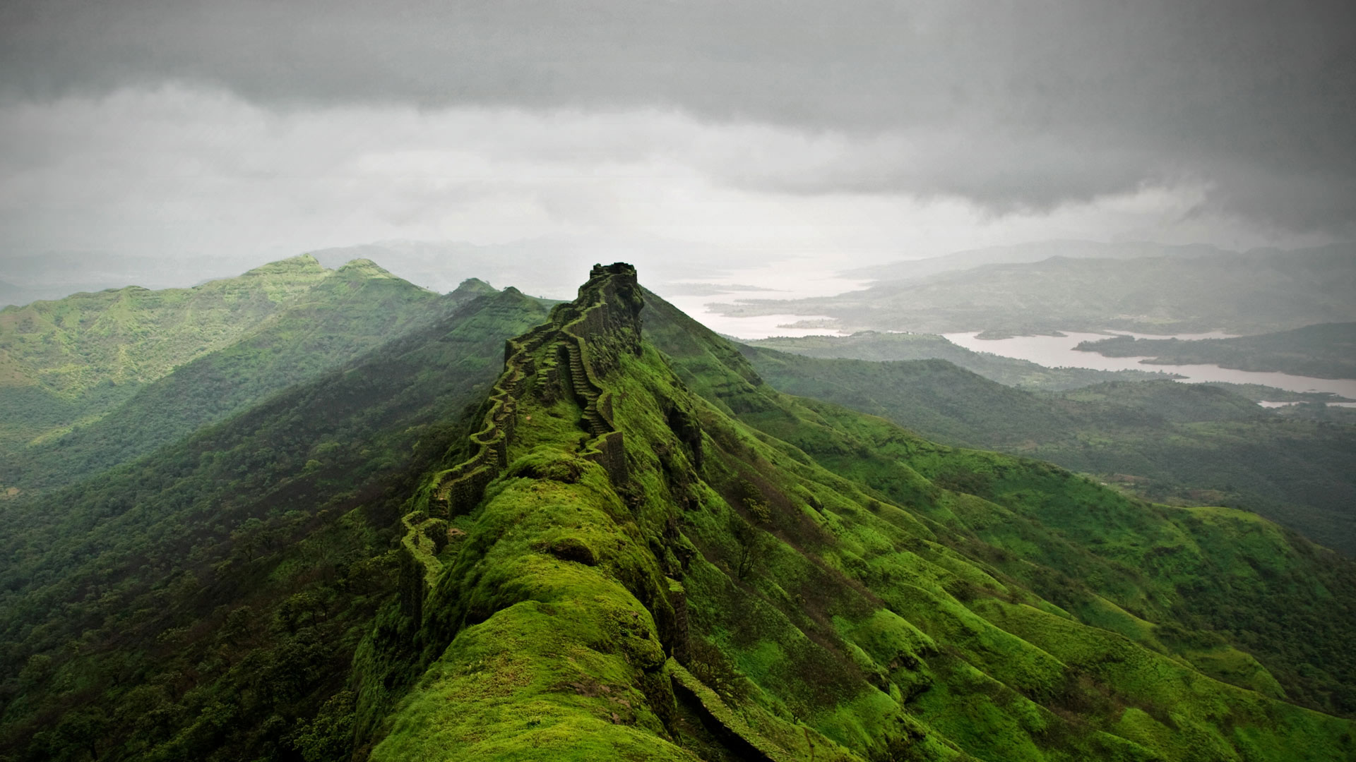
Ruins of Rajgad Fort near Pune, Maharashtra, India
photo by Rohit Gowaikar
website - https://www.flickr.com/photos/flickrohit/
original image - https://live.staticflickr.com/3555/3784712507_d1f06cfeaf_o.jpg
Windows 10 Spotlight version - https://h2.gifposter.com/bingImages/FortRajgad_EN-US4329326138_1920x1080.jpg
I really like this, looks like the walls and stairways of the fort are sprouting straight out of the ridge of the mountain.
But this is a good example of another pet peeve of mine - vignettes! A lot of times, they will be caused by the lens, but more often than not, photographers add them in to draw your eye to where they want to. I really really dislike them, and they are really really hard to remove. I think that if you have to use them, there is already something wrong with your composition and lighting. They are OK when subtle, but again, more often than not, people go overboard. And it tends to become a habit - they start poping-up wheter there's any need for them or not. 'It cant hurt.' Yes it can. It's like you put horse blinders on the viewer's eyes. They're looking where you want, but it's not pleasant.
So, I removed the bloody thing. I actually used the Windows 10 Spotlight version of the photo as the starting point, because they did a good job of reframing it. It looks better with the fort at the left third instead of dead center, opens out the background nicely on the right. Also, I darkened the top cloud, to better focus on the subject (there, do things like that, instead of adding in @"#$! vignettes), and to reduce the glare, which, as I said before, I don't like in wallpapers.


No comments:
Post a Comment
Good or bad, let me have it.